If you missed Mark Beatty’s recent exhibition at the Clonakilty Community Art Centre, then you missed an absolute gem. Beatty’s work has a rare, living vibration: raw yet refined, open-ended, yet delineated, infinitesimal yet whole, genuine yet subtly ironic. Stepping into the gallery I immediately felt a quiver of visual delight, an instantaneous flood of cognition – and of recognition; something similar to the sense of wonder elictited whilst gazing at the Chi-Rho page in the Book of Kells, or Big Yam Dreaming by Emily Kngwarreye, or an infinitesimal biro work by Icilio Martich-Severi.
Such instant, deep delight, is the call of art: a space where composition opens us to a mysterious clarity and a sense of wholeness, generated through the most tender, strange, and articulate rhythms. It is the call to a deeper life, to a life of the spirit. And it is a life Beatty appears to be living boldly.
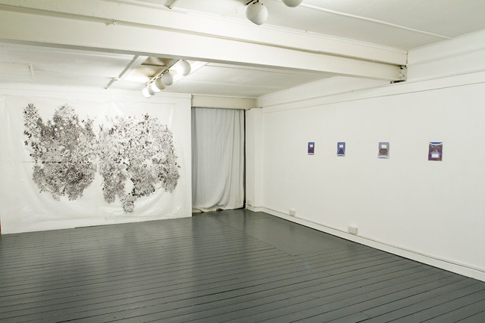
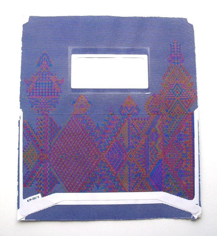
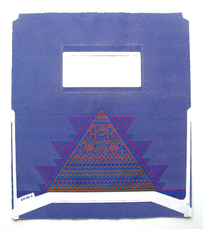
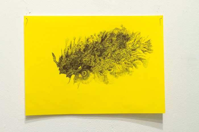
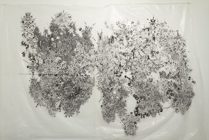
Nine small works on paper and one wall-sized work on plastic comprised the show, pointedly titled Time. Spent. Drawing. Of the small works, seven utilize the inside patterns of envelopes, whilst the other two are drawn on cheap, coloured paper. The plastic, for the wall-sized work, was formerly packaging for a fridge. Beatty approached his low-fi, recycled supports with equally humble materials: biro, marker and coloured ink.
The works were presented simply, yet meticulously, pinned to the wall, without frame, protection or title, accentuating their sense of vulnerable beauty, of raw, fragile life. Names are both doorways and barriers; too often we forget that they are fictions, which can distract us from the reality they attempt to signify. Beatty denies us the foothold/distraction of a title, leaving us suspended with the raw phenomena of drawing.
The use of every-day, low-grade, ‘waste’ and recycled material has its roots in modernist practice (think of Picasso’s famous ‘bull’, made from a bicycle seat and handle bars) and has become a regular strategy in post-modern practice. It is, in many instances, born of a desire to surprise, to find beauty in the ordinary. It is also, however, born of a wish to ‘pull the rug’ from the establishment, to usurp the hierarchy of matter and to challenge systems of value. It is, of course, also an economic strategy for artists of limited means. And last, but not least, it is a way of creatively breaking free; when the materials are not precious or expensive an artist can truly open up and wander, into spaces they wouldn’t otherwise dare.
Beatty’s motivations are most likely a combination of all the above. There is something of the anti-establishment street artist about Beatty: the transformation of social security envelopes into supports for jewel-like invocations of the most subtle, Islamic-style geometric ornament, the reclamation of commercial packaging as support for a non-commercial, opulent, graphic feast, channeling the generative energy of Celtic book illumination. On one level it is a poke at monetary systems of value and commercial expectations, on another it is a show of pure life and ingenuity. But it is also a sophisticated strategy born of post-modern art schooling. For where the commercial world is at a loss, the inner eschelons of the contemporary art world thrives. The trick for artists like Beatty is reaching the ‘promised land’ of the contemporary museum, via the ‘desert’ of commercial reality.
But enough of conceptual underpinning. Above and beyond any ‘strategy’ lies the drawing itself. Beatty’s gifts as a graphic composer are considerable and are rooted in a simple joy of ‘doing’. As the artist himself writes, “My work…adopts the activity of drawing as a ‘doing is thinking’ method of occupying time.” By his own admission he does not draft or preconceive his works: “The works grow slowly, a line at a time, each being of minute vantage.” Beatty likens the “physicality of drawing” to the recitation of a mantra. It is a fitting analogy for works of such clear, steady and rhythmic energy.
Beatty’s work appears, whether consciously or no, to channel two great traditions of ornamentation: the Celtic and the Islamic. I do not use the term ‘ornamentation’ in its modern sense, denoting something decoratively superfluous, but in its ancient, art-historical sense, as an orchestral language of form.
The language of Islamic art is a seemingly limitless combination of geometric motifs, generating in the eye a sense of the infinite. It is a way of visually engaging the spiritual dimension without recourse to imagery, forbidden in the Islamic faith. Celtic ornament is an entirely different creature, utilizing all manner of spirals, scrolls, interlace, dots, lines, circles and zoomorphic forms. In orchestral formation these languages of ornament have given rise to the most stirring and mystical works of human art, such as various illuminated pages, or ‘leaves’, in the Book of Kells.
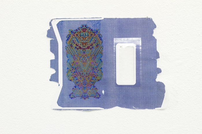
Colouring the hexagonal units of the honeycomb pattern, which covers the inside of envelopes, Beatty has generated stunning geometric compositions, which appear simultaneously cellular, ordered and organic. The compositions are, to an extent, governed by the spatial potential of the envelopes. In some cases the geometric forms surround the plastic window, in another, they form a pyramid, pointing up to it. The edges of the envelopes are torn from opening, the raw tears contrasting starkly with the enchanting geometric worlds created within. Beatty writes, “The drawings are alive while being processed and a relic when they are complete.” It is a deeply beautiful observation and the truth of it is accentuated by the relic-like nature of the envelopes themselves.
On a spiritual level I have found that authentic compositions glow like mysterious ruins – like fragments of the spirit briefly glimpsed in corporeal matter. I felt this most keenly when confronted with the work of the Italo-Australian artist, Icilio Martich-Severi, whose work holds much in common with Beatty’s. Like Beatty, Martich-Severi used biro and marker/texta. His timeless compositions were forged with the most humble materials. Like Beatty his graphic forms grew from point, to line, to form, from the centre outwards, vortices of slow, dream-like dances, fragments of dream on the edge of the void.
Such is the feeling of Beatty’s drawings on coloured paper and plastic. Like floating coral or fantastic, coral-like beasts, they pulse as living things. The marks breathe, flow, ripple, darken and fade. On the forging of his work Beatty writes:
“The work is all the time growing, becoming something – it informs me as to its outcome. This ‘blind’ approach keeps the work engaging. The finished works are a diary of my handling of time. I see their slow coral-like growth as a deliberate slowing down, a quiet protest against the busyness of contemporary life.”
In the large composition on plastic Beatty has employed a very playful language of ornament reminiscent of modernist as well as medieval graphic styles. Concentric, cellular forms, forged in clusters, spread out like algae, colonizing space with infinitesimal fervor, their circular rhythms given tonal voice by negative and positive spatial inversions, whole regions darkened in the negative, the white lines glinting like jewels in a rich forest of secret Baroque design…
The plethora of biomorphic linear forms variously resemble flowers, crosses, genitalia, cells, breasts, torsos, birds, beaks, scissors, animal forms, Disney characters and more. The forms recall elements of pop art (think Keith Haring) as well as early abstract animation (such as the work by Len Lye). The spirit of growth, and the playfulness of the forms, is also somewhat akin to that found in Celtic book illumination. In this case however, the support is plastic, not vellum, and there is no sacred book to be adorned. Beatty’s ‘shield’ of ornament, rather floats, in a post-Christian, agnostic sea, upon a temporary wall beheld by a limited gaze.
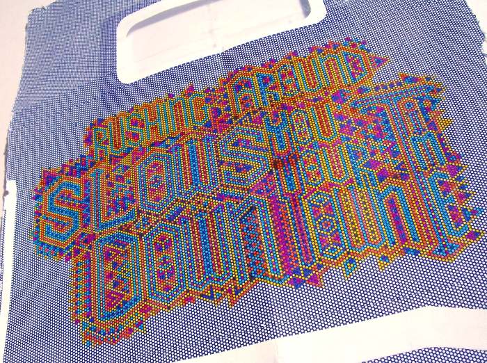
The one text-art piece in Time. Spent. Drawing. acts as a bridge between the Western and Eastern aspects of the show. It is essentially a block of illuminated ornamental text, akin to that of text blocks drawn in medieval manuscripts (not withstanding the fluorescent colouring), rendered on the inside of an envelope, in the same way as the purely geometric works. The more legible text reads: ‘Rushing around slows you down.”
Time. Spent. Drawing. reveals a young artist who is both wise and poetic; graphically gifted with a timeless touch and a conceptual lightness which adds to rather than diminishes his vision. That being said, the conceptual strategies at play, the material ploys, are not essential to his growth. At heart and centre is a composer, and one hopes he will continue to engage all means – high as well as low – at his disposal.
Article by James Waller www.jameswaller.org


